Monday, 21 December 2009

How Did You Use New Media Technologies In The Construction And Research, Planning And Evaluation Stages?

Throughout this project I have used a vast amount of new media technologies, here I intend to discuss some of the technologies I used and what I used them for, I will also be comparing them to older media technologies such as analogue technologies for example, VHS.


Throughout this project there has been one major technology I have constantly used, blogger, this site has allowed me to upload every single piece of work I have created very easily, it also meant that I could upload images and video I have created, and with the comment box tool it made it very easy for my colleages to leave comments on my work, from which I could improve it, however there are several bad points that I have found with blogger, firstly, inserting pictures and video into a post does obscure the text, meaning the layout on the post was very different to that of the editing box, also lately blogger has added an updated editor, which in many areas is a large improvement, however this does meen you have to constantly revert to the old editor in order to upload video, which made it very time consuming.


Another new media that has vastly improved my work is upload sites, such as scribd, youtube and photobucket and I have used these for many different reasons, firstly I used scribd to upload word documents onto blogger without them turning into an actual post, making the layout much better and taking up much less space.
I have also used Youtube a very large amount generally to view other media texts such as movie teaser trailers or short films, it also means that if I wanted to I could upload my work onto it, possibly getting a wider audience feedback.

One of the most important pieces of software that I have used throughout my project is Adobe Phoptoshop, this photo editing software has allowed me to create teaser posters, final poster, a magazine cover, a production logo and many more. This piece of software is widely used and is classed as a proffesional piece of software, below are some of the images that I have created using it.

This year I have been very lucky to use a proffesional piece of editing software, Final Cut Express 4 which is used largely in the media industry, that has been a very big step up from the previous software we used in the AS course, I movie 6, there are many different features between the two such as editing tools and sound tools, however Final cut also contains it's own programme used for editing text called, Live Type which has been extremely useful in creating high quality dynamic pieces of text, which can be seen in the final cut I created. 
This piece of software is a very new piece of media and allows digital footage to be easily edited however some older media such as VHS would not run on the programme and therefore shooting with modern camcorders is crucial to the uploading stage of the footage.


In terms of audio I have been using garageband, this is not an advanced piece of software however it is very easy to create good quality pieces of music and has a very large libary of sounds that can be used.


To record my footage I used a brand new digital camcorder, which unlike the previous camcroders I have used records onto a hard drive instead of a DV tape, at first this seemed a much better option, however some of the computers, Macs, that I had been using do not accept the format which my camcorder recorded in and so it limited me to the type of computer I could use, below are some of the key specifications of my camcorder,

Price: £329.99
Record Format: 120GB hard drive
HD Ready: Yes
Recording Time Limit: 150 hours


In conjunction with audience feedback, I have uploaded all the footage onto a social networking site called Facebook, this meant that not only my class colleagues but many other people of different ages could give me good constructive feedback on my work.

What Have You Learned From Your Audience Feedback?

Throughout this module, audience feedback has contributed greatly to most of the tasks I have carried out, I have shown audience feedback in each of the posts where I have received it, I then used it to improve my products, take my film poster for example, previous to audience feedback it looked like this,


However, after receiving the following audience feedback,

  • Doesn't reflect the content of the trailer
  • Too cluttered
  • Copyright image used
  • More images needed
  • Title not clear enough

the finished product looked like this, which I believe is an enormous improvement


One of the first items I received audience feedback on was my animatic, this is basically an animated storyboard made up of pictures and title sequences, below is the audience feedback I received on it,

Chris Benisek
Age: 17
Comments:
  • got confusing in the middle
  • not enough blood!
  • not sure if the comedy was intentional
  • why was there a random girl? what was the purpose?
  • i enjoyed the soundtrack

Tom Copland
Age: 17
Comments:
  • unclear narrative
  • not very convincing acting

Conor Potts
Age: 17
Comments:
  • I liked the storyline
  • music needed to go together better

Alex Jowett
Age: 17
Comments:
  • zombies may be hard to make look realistic in the actual trailer

Joe Shrimpton
Age: 17
Comments:
  • more of an introduction at the start is needed
  • soundtrack worked well
  • would look better and scarier if it was set at night

Helena Beason
Age: 17
Comments:
  • Unclear as to why the two characters thought it was a zombie
  • relevance of woman was unclear
  • would look better set at night
  • better looking zombie!
as you can see i received a large amount of feedback relating to the lighting and that it would be better if it were set at night as it would create a preffered reading to the horror content, however after attempting to film in the dark i discovered that the lighting was too poor and characters along with actions could not be made out easily enough.
I also received a large amount of comments as to the purpose of the girl involved and that it was not clear as to why she suddenly appeared, this took a large impact on my storyline as I decided it was best to change the cast accordingly.

After receiving audience feedback on my animatic I then decided to change my storyline, once this was done I created a rough cut of my trailer, again I screened this infront of a class of pupils and recieved further audience feedback which is shown below,


  • as-well as an american age rating screen have a version with a UK rating screen
  • Treadman character does not project his voice loud enough
  • change the font to represent genre
  • Some of the voices are too quiet
  • music does not go with the production title
  • Girl is laughing when getting her stomach ripped open
  • Elroy does not appear as their friend
  • Colour of the font
  • Over dub some of the voices
  • controversial rock music
  • eery music should be added
  • speed up the spade hit
after recieving this feedback I decided to change a large amount of things, firstly I changed the font of the titles, this signified s supernatural style i.e. linking in to a preffered reading, I also changed the font colour half-way through the trailer from white to red, which was in key with the action starting i.e. killing the zombies, however I beleive I maybe could have found a better font as the one I choose was a little plain, also, with the assistance of final cut express 4, a proffesional editing software, I managed to raise the sound of the characters voices, which seemed to be a big issue as many of the audience said they could not hear the voices clear enough, however if I were to do any re-shoots then I would most likely use the boom mic that I have access to, as not only does this pick up sound better but the sound is also of a much higher quality.
Although the final cut was a huge imporvement on that of the rough cut, I still beleive there are a few things i should change, such as the quality of some of the acting, however, at the present the weather has been very different to that of my other scenes and would challenge the continuity of my trailer. 
I would also change the music, although I beleive the soundtrack is of a high quality I beleive it changes to often and is too overpowering to the actual footage.


After receiving an initial grade I combined it with the audience feedback I received especially on the ancillary texts, generally saying that it did not reflect what was seen in the trailer, I used this to help recreate both the film poster and the magazine front.

How Effective Is The f Your Main Product And Ancillary Texts?Combination O

The main part of my project was obviously the final product i.e. my teaser trailer, however both the main poster and magazine front cover are hugely important to the success of my project.

Before I created the main poster I also created a teaser poster campaign, which led to the final poster which I created.
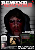
when designing the poster I wanted to get across a number of things, firstly that the film is about zombies, clear anchorage is given to this through the hooded character in the image, I also wanted to portray vioence and horror, which I beleive is shown through both the blood dripping from the zombies mouth and the 18 certificate located in the cottom right corner, finally I wanted to portray what the zombies in my film are like, in most zombie films there is a general theme for example in Dawn of the Dead, the director, George A. Romero wanted to portray the zombie like nature of shooping malls and how the general public walk mindlessly around them buying everything in sight, in my film I have attempted to portray the zombies as hooded youthes, representing the violent nature of hoodies living in Britain.

When creating the front cover of the magazine I wanted to portray a very similar message to the main poster I created and so I kept the background of the poster the same and then obviously changed it according to the title of the magazine (Rewind).
I also included some sub texts on the magazine, one of which I thought was very important, an interview with the "unusual" director Ellis Clark, due to the bizzare storyline and comedy shown in my teaser trailer I thought it was very important to include something that portrays me as a director and why I added some of the unusual scenes shown in the trailer.

The ancillary texts were a very important section of the A2 module, however so was the final product and so once I had collected all the footage I needed for my trailer I thought it was important to edit the footage at a proffesional level using Final Cut, for this proffesional programme I watched a few tutorials along with some tutorials for the text creating side of the software 'Livetype', below are some of the tutorials which I used,


After receiving an initial grade I decided that my ancillary texts were not of a good standard and so I decided to completely recreate both the magazine front cover and the main poster for my film, below are the before and after products,

Main Poster
Before


After


Magazine Front
Before


After


I feel that after doing some more research into movie posters and magazine covers it meant that I had a much better understanding as to what I could include in mine.

Before I re-did my ancillary texts I received feedback that both my poster and magazine front cover did not reflect my final trailer and so I decided to completely re-create both of them, to do this I took some more photos as well as using this photoshop tutorial to create some zombie/undead styled faces to signify the zombie parts of my film.

In What Ways Does Your Media Product Use, Develop Or Challenge Forms And Conventions Of Real Media Products?

Throughout the whole project I have had to research into other films and media products in order to get a clear insight as to what I could include in such things as the ancillary texts and the final product, however throughout collecting the research and planning my tasks I wanted to be original and use some creative flare, which I beleive is shown through the work I have produced.
In this section of the evaluation I intend to compare my film to that of others, how it's different, similar and how it challenges them.

Throughout my project of creating a zombie film I have looked closely at a number of similar films, mostly looking closely into Shaun of the Dead, Dead Snow and Zombieland,


I choose to look into these three films as they are generally very similar to my idea, they originate from the same style genre i.e. comedy/horror and of course are based around zombies.

One of the key areas I researched into was casting, to create a preffered reading for the text of my film, I felt a strong cast was needed and, when creating my post on the cast, and who I attempted to base my characters on, I originally looked deeply into Shaun of the Dead, attempting to recreate the two binary opposition chracters, Simon Pegg and Nick Frost along with the steroetypical good looking female character, Kate Ashfield, however, later on during my research I decided upon a new idea to mix the genre of road trip with horror including teenage characters to play my main roles, from this I decided to look closely at the cast of Road Trip with the idea to use 4 average college students with whom their personalties constantly clashed.

I feel that the characters I casted for my trailer fitted their roles very well, although some acting was unconvincing and perhaps if I had more time I would re-shoot some scenes, for example some of the fighting scenes looked inconvincing.

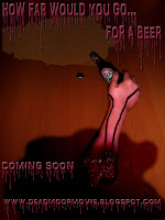
When it came to creating my ancillary products I wanted to keep a similar idea to that of my teaser campaign, i.e. with the tagline of the film being "How Far Would You Go... For A Beer?".
Early on when creating my teaser posters, I took a large amount of inspiration from that of the Saw posters, i.e. with the cut off hand, however along with my tagline I put a beer bottle in the severed hand giving a preffered reading to not only horror and violence but also comedy.

When creating my magazine cover I knew that it was important to create a similar layout to that of many other magazine front covers such as Empire, which is renowned as the biggest film magazine or Total Film for example and so when creating my front cover i attempted to use similar layout strategies that would attract a large audeince as both the other magazines do however I feel that my magazine cover did have a few weaknesses, firstly i beleive the title did not stand out or look proffesional enough to that of my target audience, and there fore did not bind well with the front cover image, when looking further into magazine covers with film specials, I noticed that the title sometimes would change colour or style in order to match that of the front cover image, for example when empire magazine did a special on the latest Batman film, The Dark Knight.


To create my teaser poster I did a very large amount of research into both teaser trailers, broken down and also the codes and conventions on teaser trailers, i.e. what they usually include, I feel that this was one of my strong points throughout this A2 course and meant that my final product could be highly related to that of other real media products such as the teaser trailer for Shaun of the Dead. However I feel that if I had the time to change any aspects of my teaser trailer then I would posibly change the music to relate more closely to that of other real media products.

Introduction To Evaluation

Throughout this evaluation I intend to evaluate the A2 module which I completed in December, When I originally handed in my A2 module I was not fully satisfied with a number of aspects such as my ancillary tasks and some of my research and so I decided to re-submit my coursework.


After initially receiving a C grade for my coursework I decided that I could vastly improve many sections of it, mostly the ancillary texts and also the evaluation itself, within my evaluation I will also need to include an evaluation on all that I have improved.

Sunday, 15 November 2009

Production Logo


Above is the production that I have created along with my production name, Death Road Productions which is a pun on the thrase death row, that little red riding hood resembles horror along with the blood writing and the dark trees which give it a very spooky look.

Thursday, 12 November 2009

Teaser Posters

As part of my Teaser trailer I shall be creating some teaser posters, as I am creating a teaser campaign, below are the teaser posters that I have created.


Teaser Poster 1

To the left is the first teaser poster I have created using photoshop elements 6 along with some tutorials on how to create blood effects, I believe it gets a good message across to my audience and does create a large amount of narrative enigma, however I do not feel it looks realistic enough and I may re-create this teaser poster for my second one.


Teaser Poster 2

This is my second teaser poster that I have created and believe it is a vast improvement from the first one, it looks much more realistic, the writing looks more realistic and professional and I believe overall it creates a good preferred reading of my film.


Teaser Poster 3

This is the third teaser poster which I have created and it represents the zombies in my film, i.e. hoody youths, I used a mug shot background aswell as writing to match it to signify that hoodies and youthes are bad.

Podcasts

Week 1

This week i'm taking you through the general idea of the film, where I got my influences from and what pre-production tasks I have completed so far.

Tuesday, 20 October 2009

Codes and Conventions of Teaser Trailers

  • after doing a very large amount of research into teaser trailers the most important aspect i have found has been the structure of the trailer. This is usually similar throughout all trailers but in particular horror teasers, from what i have gathered they are usually layed out like so, for the beginning of the trailer it will start with a narrative generally with a voice over from a narrator or one of the main characters it could also include titles to give clear denotation of what is happening, it will then carry on with some slow pace music setting out very briefly the kay parts of the story line, about half way through the teaser the music will stop for a key line or tagline from one of the main protagonists or characters, as soon as this is said fast paced music and clips of violence will be shown, the pace will then usualy slow down for the title of the film, in allot of cases throughout the teaser the music will completely stop for a key line from one of the characters, for example this technique is used in both the hot fuzz and shaun of the dead teaser trailers, after the title of the film has been shown it will usually finish on a final clip such as a tagline, explosion, comcial expression etc which will then lead into the credits of the trailer
  •  most of the teaser trailer tend to be around 1 minute - 1:40 minutes however some teasers can be very short such as the Coen brothers Fargo, where the teaser only lasts for 29 seconds
  • the titles and writing in the horror and action trailers that i have analysed tend to be done in a serif font which tends to match the style of the film, for example the titles in Kill Bill, where they are all done in block yellow lettering to match that of the main characters clothing
  • they tend to show as much action or love scenes as possible to attract there intended audience, hot fuzz have created a preffered reading for a young audience with a clear amount of explosions and guns

Wednesday, 14 October 2009

Teaser Trailer Analysis

Release Date: 2004
Budget: $4m
Production Company: Studio Canal, Working Title
Director: Edgar Wright
  • begins with serious music played over the narative
  • comcial music is played, signifies it is a horror comedy
  • stereotypical chracters play the clumbsy comical roles
  • gore and swearing connotes it is either rated a 15 or 18
  • music changes to a fast pace which connotes action
  • music changes back to a comical fashion, signifies comedy


Release Date: 2009
Budget: 
Production Company: Columbia Pictures
Director: Ruben Fleischer
  • begins with a male voice over which sounds serious
  • at the frist sight of a zombie the music begins, fast apced music which signifies action
  • main potragonist is a steretypicfal butch male
  • high camera angle as the establishing shot, signifies threat
  • music is in que with the action
  • sllo-motion editing is added to enahance parts of the action
  • fast paced editing along with sans serif titles are used
  • music stops when it comes to a key comedy part
Release Date: 1978
Budget: $650 000
Production Company: Laurel Group
Director: George A. Romero
  • begins with a male voice over
  • makes use of meantioning past films which the director has made, brings in a familiar audience
  • unusual colours are used to signify something is not right
  • dark, horrific msuic is used to connote horror
  • title of the film done in a red serif font to signify blood and horror
  • shows violence and action to bring in it's target audience
  • a large amount of point of view shots are used to create the image that the viewer is part of the film
Release Date: 2007
Budget:
Production Company: Paramount Pictures
Director: Akiva Schaffer
  • music begins as the main protagonist starts his motorbike engine
  • shows a shot of both the female and male protagonist, stereotypical for romance between characters in a comedy, man thin, shy, average looking, female good looking, slim, kind
  • music volumes lower when characters speak
  • general plot is given away
  • displays the main actors/ actresses names
  • serif font and matches the style of the film i.e. comical bubble writing
  • the last title isthe release date so that it stays in the mind


Release Date: 2002
Budget: $8m
Production Companies: DNA Films, British Film Company
Director: Danny Boyle
  • Starts with fox production logo, and is edited accroding to the film i.e. the searchlights turn off, signifying that something is not right
  • clear denotation as two what is happening is given through the use of titles with quick flash scenes and sound played inbetween them again signifies something is not right
  • the tempo of the music and scenes slows down as a man wakes up in what can be deconstructed as a hospital again signifying that something is not right
  • music is qued with the alarm of a car
  • as the music starts again it returns to quick paced editing but instead of titles a voice over is added which could connotate that people are still alive whereas titles leave narrative enigma to wether anyone is still living 
  • makes use of showing other film done by the director, brings in a wider range of audiences
  • the action and quick paced editing creates a preffered reading to a younger audience
  • the main protagonist is played by a countertype, much like the main male protagonist in a rom com, thin, average looking etc
  • finishes with a tagline, then quickly jumps back into the music and action again for 3 seconds or so


28 Weeks Later 
Release Date: 2007
Budget: 
Production Companies: Fox Atomic, DNA Films, UK Film Council
Director: Juan Carlos Fresnadillo
  • Production logo done in red which signifies blood
  • high angled shot over london makes it look weak
  • denotation is given by thde title "quarantine" i.e. london has been locked down away from zombies
  • military and guns denotes violence
  • music slowly gets faster which signifies violence is about to happen
  • music is qued with the siren and the voice over saying "code red"
  • quick paced editing creates a preffered reading for a young audience
  • gives the release date at the end


Dawn Of The Dead 
Release Date: 2004
Budget: $28m
Production Companies: Strike Entertainment
Director:  Zack Snyder
  •  starts with slow music over the production companies logo's
  • merges into the first few shots of what can be denoted as a shopping mall, with only a few people in it, possibly abandoned 
  • pace of the trailer and music changes when it shows the news, people abaondoning streets and cars, things on fire etc
  • shots get faster and faster and then slow down as denotion from the newws reporter is given as he says "we're going off the air"
  • people holding guns suggest action and violence
  • a series of fast paced editing where zombies are attacking people and there is generally a large amount of action and violence
  • music slows down again as the title and credits come onto screen towards the end of the trailer
     

Day Of The Dead  
Release Date: 1985
Budget: $3.5m
Production Companies: Dead Films inc, Laurel Entertainment inc
Director: George A. Romero
  • begins with the production logo on the screen whilst spooky music is played in the background
  • has a male voice over as titles of previous films come onto the screen 
  • blue tint on the titles suggests something supernatural
  • gives the name of the director, clear denotation 
  • in the whole trailer there is only one shot where hands come out of the wall, this creates narrative engima and makes more people want to see the film
  • finsihes with credits


Release Date: 1978
Budget: $320,000
Production Companies: Compass International Pictures 
Director: John Carpenter
  •  Comapny credits come onto the screen as light harted oppositional music is played over the top
  • opening shot appears to be a point of view shot
  • denotation to the time is given via a title reading "October 31st, 1992"
  • has clips of what can be denoted as a boyfriend and girlfreid which could signify jealousy of a certain chracter
  • music changes as a mask is thrown ointo the floor, which could signify the mask of the main killer
  • point of view shot shows a girl looking at herself in the mirror makes her appear in trouble
  • shouts micheal like she is anoyed giving conotation that he could be the killer
  • a voice over reads out the title "halloween" which is written in a serif font


Release Date: 2009
Budget: $200m
Production Companies: Dreamworks, Paramount Pictures
Director: Michael Bay
  •  begins with a shot of meteors crashing into buildings which creates narrative engima as to what they are
  • keeps on switching between fast paced scenes and titles
  • music is in que with explosions and the action
  • states who the director is which brings in a wider audience
  • sound and mood of the trailer slows down in the middle to hear some of the dialogue, it then speeds back up again as it goes back into the violence
  • stereotypical male and female characters, slim and good looking
  • scene cuts are done in a sci-fi style
  • the tagline is displayed in a serif font, similar to the style of the movie


Saw 
Release Date: 2004
Budget: $1.2m
Production Companies: Evolution Pictures, Twisted Pictures
Director: James Wan
  • begins with pictures been taken, possibly signifes spying on someone, he should not be there
  • music begins as someone in a mask comes towards the screen
  • the sound of a heart beat can be heard over the top 
  • quick cuts to different clips signifies violence or action
  • voice over gives denotation as to what may happen in the storyline
  • dark mysterious voice over signifies horror
  • green and blue tinted lighting is used which also signifies horror
  • titles appear on the screen inbetween each clip
  • msuic and clips speed up towards the end of the trailer and then slow down when the tagline is spoken


Release Date: 1984
Budget: $1.8m
Production Companies: New Line Cinema
Director: Wes Craven
  • begins with dark music played over the production logo
  • establishing shot is of a quiet warehouse at dark with a blue tinted light signifying something supernatural
  • rips off his coat rto reveal a red and black stripey jumper, gives denotation to the fatc that he is freddy kruger
  • directors name is hsown and titles are done in a blood writing style to signify horror and violence
  • voice over begins and gives denoation to the storyline
  • music sung by what can be deonted as a little girl creates a spookmy atmoshpere
  • faster louder music begins as freddy scrapes his claws against some metal
  • scene cuts are in time with the music and get faster amnd faster
  • last clip is of jason speaking some lines calmy and then quickly lashes, where the music starts up again


Release Date: 2009
Budget:
Production Companies: Euforia Film, Yellow Bastard Production
Director: Tommy Wirkola
  • begins with two of the characters counting down which sets a good start for the trailer
  • rock music kicks in with the snow mobile and coincides well with the young people that are on the mountains
  • a clip of a woman in a bra is shown to bring in more of a male audience
  • the music changes and slows down as a more older character begins to talk
  • the music slowly begins to pick up again as the title of the director is shown on screen
  • a black and white movie ois shown about the history of the area as there is a voice over and removes narrative engima from the plot
  • music gets faster again as what can be denoted as a zombie hand comes out of the ground
  • titles are done in a serif font made to look like gore/blood
  • and comical line is the last clip at the end


Release Date: 1981
Budget: $10m
Production Companies: Polygram Filmed Entertainment, American Werewolf Corp.
Director: John Landis
  • narrator starts the first set of the trailer, gives small information on the two male characters
  • wolf houl signifies there could be a werewolf involved
  • quickly cuts to the werewolf attacking them, shows action and creates a preffered reading
  • narrator says who the director is and past films that he has made
  • aswell as showing clips of horror and violence the music changes to show comical parts of the film
  • light hearted music over the horror and violence could signify that it is a black comedy
  • the narrator speaks of the tagline "something different" as the horror film is done in a different style to most that you would usually see


Release Date: 2000
Budget: $19m
Production Companies: Dimension Films
Director: Keenen Ivory Wayans 
  • to create comcial horror over the top blue tinted lighting is used
  • clear intertextual references to scream are made very early on in the trailer which should bring in a wider audience
  • non-diegetic sound of a narrative is added over the top to reinforce any narrative engima
  • peoduction logo is in sync with the knife slash
  • horror music stops as a comical clip begins, the narrative then ends
  • steroetypical blonce woman is used running away from the killer
  • over the top sterotypes and situations are used as a comical factor
  • title at the end is done in a large white lettering and fits in with the white mask from scream


Release Date: 2006
Budget: 
Production Companies: Dan Films, HanWay Films, UK Film Concil
Director: Christopher Smith
  • non diegetic sound mixes in with diegetic sound 
  • light hearted music at the start creates a contested reading and leaves narrative enigma to what genre the film is
  • non-diegetic sound is in sync with the titles
  • good looking half naked blonde woman brings in a larger male audience
  • faster rock music begins with the shot of a shotgun which signifies violence
  • music then stops again for a comical clip
  • scraping of carving knies also denotes violence
  • music speeds up as the clips speed up
  • connotation between the last title and clip can be seen as the man is hanging from a tree about to be cut down and the title reads "the company is making cut-backs"


Release Date: 1996
Budget: $7m
Production Companies: PolyGram Filmed Entertainment, Working Title Productions
Director: Coen Brothers
  • very short teaser trailer mainly getting the most imp[ortant parts of the film across to the audience such as the directors i.e. "The Coen Brothers"
  • shows ratings from newspapers, magazines etc. 
  • gives the genral idea of the film through the use of titles "murder" "A Homespun Story" etc
  • only music is used no diegetic sounds etc.
Release Date: 2009
Budget: $35m
Production Companies: Warner Bros. Pictures, Legendary Pictures
Director: Todd Phillips
  • sound of the telephone comes in over the production logos
  • music starts on one of the main lines
  • titles are done in a serif font to match vegas style billboards and signs
  • as much comical lineas as possible arwe packed into it
  • music usually syncs in with something at the start of the trailer however here it syncs in at the end of the trailer with one of the most comical clips
Release Date: 2003
Budget: $55m
Production Companies: Miramax Films
Director: Quentin Tarantino
  • titles done in bold yellow writing on a black background which makes them stand out
  • "the 4th film by Quentin Tarantino" brings in a wider audience of people who adrmire his work
  • non-diegatic sound is synced with the diegetic sound
  • quick cuts create a prefferede reading of violence to a young audience
  • all diegetic sounds stop for a few seconds to hear important diwegetic sounds
  • last title is done in red, which makes it stand out from the other titles and can also signify blood or love
Release Date: 2002
Budget: $48m
Production Companies: DreamWorks SKG, Bender Spink
Director: Gore Verbinski
  • blue tinted lighting is used right from the start to signify something supernatural
  • narrative enigma is added to the title, "there is a videotape" which makes the audience wonder what is on the video tape
  • titles done in a spooky serif font to give thwe effect of horror
  • quick cuts between a fuzzy screen and movie images creates the effect of an old video
  • spooky music is played in the background 
  • stereotypical female good looking character plays the lead role
  • non-diegetic music is played throughout the trailer, i.e. a voice over created a spooky effect


Release Date: 2006
Budget:
Production Companies: Craven-Maddalena
Director: Alexandre Aja
  • production logo is edited according to the style of the trailer, i.e. black and white poor quality picutre which signifies something which has happened in the past
  • begins with what has happened in the past, which can be connoted as where the film will be set
  • the style and editing then changes to signify the present and light hearted music is also played
  • the non-diegetic music mixes in with the diegetic music
  • music changes to a moor spooky style as what can be connoted as the killer or evil person in the film comes into the clip
  • a large amount of point of view shots along with heart beat sounds are used to signify that something is watching the main group of characters
  • sterotypical american family and boyfriend and girlfriend, i.e. males take control of the situation whereas the females are blondwe, good looking and generally get easily captured or killed
  • non- diegetic music mixes in with the diegtic heartbeat sounds to create a preffered reading of horror within the audience
  • generally the main evil characters are not shown just mainly shadows of their figures or outlines
  • quick paced editing is used inbetween clips and also pictures, which also links into the heartbeat sound and the transitions between each become faster as the heartbeat becomes louder and faster
  • the name and tagline of the film are the last titles to be shown and are done in a serif font


Release Date: 2007 
Budget: $15m
Production Companies: Craven-Maddalena, Fox Atomic
Director: Martin Weisze 
  • calm music fits in well with the desert setting, abandoned as it seems
  • chracters feet come into the screen, can be dennoted as bad characters in the film due to their scruffy clothing
  • low angled shot makes them appear big and powerful
  • carry a sack which can be denoted as a body due to the feet hanging out
  • when the second character comes onto screen and drags the rope, the camera then changes to a point of view shot, and turns on it's side, could also represent a dutch angled shot
  • title done in a serif style and mixes in well with the desert setting
  • gives the title, release date and company credits at the end of the teaser


Release Date: 2005
Budget: $1m
Production Companies: Australian Film Finance Corporation, 403 Productions
Director: Greg Mclean
  • starts with drinking and girls in little clothing, signifies that they are doing something wrong and stereotypically in most horror films they must be killed
  • ametuer camera work is mixed in with porofessional camera work
  • titles are done in a serif font and look supernatural therefore signifying that something may go wrong and also creating a preffered reading within the target audience
  • stereotypical good looking dfemale and male characters
  • spooky music is played over what can be connoted as the killer in the film
  • fast music starts up after the line "i'd tell you, but then i'd have to kill you" which is a clear signifier that he will be the killer in the film
  • gives information on the release date, still in the serif font used throughout the trailer


Release Date: 2001
Budget: $17m
Production Companies: Cruise/Wagner Productions
Director: Alejandro Amenabar
  • begins with a narrative and sets the groundwork for the trailer
  • the music changes after the production logo which almost acts as a transition
  • an old spooky house is used to create a good horrific setting
  • blue tinted lighting is used to signify something supernatural
  • anchorage is given to the role of the old woman, i.e. the nanny, when she tells, what can be denoted as the mother and her two children, that she is their new nanny
  • stereotypical good looking blonde female character plays the lead role
  • graveyard outside the house signifies death and therefor ghosts
  • main title is done in a serif font, and appears as if a ghost
  • last clip is of what can be denoted as one of the ghosts and scares the audience


Release Date: 2004
Budget: 
Production Companies: UK Film Council, Dan Films
Director: Christopher Smith
  • first shot is what cana be denoted as a point of view shot with what sounds like a woman out of breathe, signifies that she has been running away from something
  • stereotypical good looking blonde woman plays the lead role
  • blue tinted lighting is used on the train to signify something supernatural
  • titles are done in a serif font which gives further anchorage to something supernatural
  • diegetic sound of a heartbeat is in sync with the clips in the trailer
  • clip transitions and sound gets faster towards the end of the trailer
  • titles are edited to look like the train in a tube station


Release Date: 2005
Budget: $4.5m
Production Companies: Hostel LLC, International Productions
Director: Eli Roth
  • begins with dark spooky music over the production titles and then cuts into the first clip of what cna be denotted as a run down house or cabin
  • taking the bag off a mans head suggests that he has been taken against his will and could signify that he will be tortured
  • titles fade in and out and are done in a serif font
  • music gets faster and louder as more and more violent clips in the trailer are shown
  • makes note of the director of the film and past films that he has directed


Release Date: 1974
Budget: $83,000
Production Companies: Vortex
Director: Tobe Hooper
  • first shot in the trailer is of a chainsaw, gives clear denotation as to the type of film
  • main killer is big and strong, sterotypical for a horror movie
  • a male voice is added as a narrative to explain that it is based on a true story etc
  • finishes on a close up of the main killer and the sound of a chainsaw which sticks in the mind of the viewers
  • all fonts are in yellow, which is an unusual colour as is the film


Release Date: 2005

Budget: $30m

Production Companies: Warner Bros Pictures

  •  quick cuts between the production logos are used which are also edited according to the serif fonts style used in the trailer
  • stereotypical teenage characters are used, good lookingbutch males and blonde females
  • quick cuts between eahc lcip creates a preffered reading of horror and violence
  • main title done in a wax style which links in with the actual title


Release Date: 2002

Budget: $32m

Production Companies: Constantin Film Production

  • starts off with what looks like an average office
  • female voice over sounds like a computer which creates a preffered reading of possibly sci-fi
  • the voice over describes the basic plot of the film
  • stereotypical female and male chracters are used
  • quick cuts mnixed in with quick music creates a preffered reading for a y9oung terget audience
  • a large amount of explosions are packed into the trailer to make it look more appealing
  • countertypical female character plays the lead role and fights 
  • makes a point of showing the main actors within the film
  • music stops for the tagline of the film


Release Date: 2007

Budget: $16m

Production Companies: Studio Canal, Working Title Films, Universal Pictures

Director: Edgar Wright
  • very fast cuts between scenes are used to draw in a young audience
  • a large amoutn of guns are shown which denotes violence
  • titles done in a serif font to match the style of the film
  • makes a point of the director of the film to bring in a wider auience
  • diegetic voice over is added to describe what is in the film unintentionally
  • mixes comical clips withg violent clip